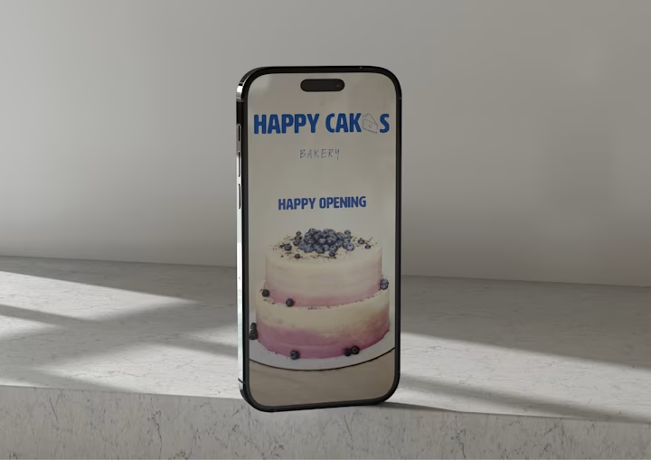
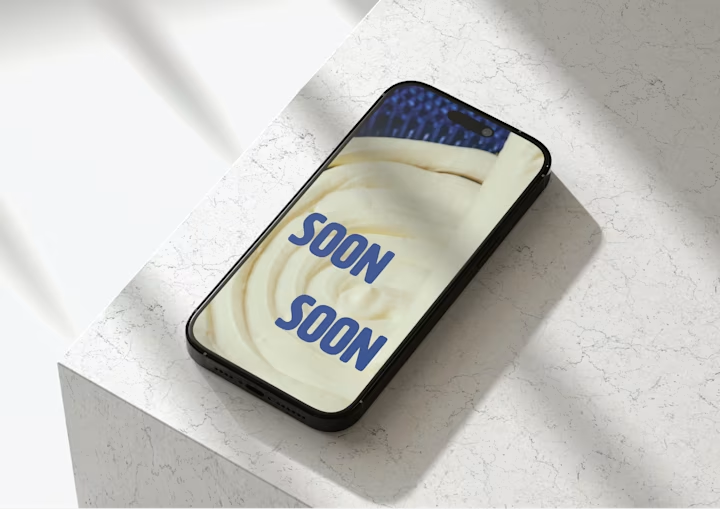
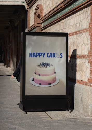
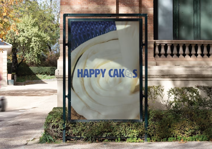
Happy Cakes is a fictional bakery I designed as a branding exercise. The brief I set: handmade but not old-fashioned.
The logo is a smiling cake slice. Simple enough to stamp on a napkin, friendly enough for a neighborhood shop.
Happy Cakes Color Palette
Primary #8BADC1
Secondary #24418B
Accent #E0D0C1
Background #FFFFFF
Text #0D0C22
The contrast that makes this work: warm type paired with stark, almost industrial photography. Close-ups show frosting texture, croissant grain, steam rising from coffee. The photos treat baked goods like design objects.
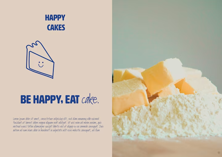
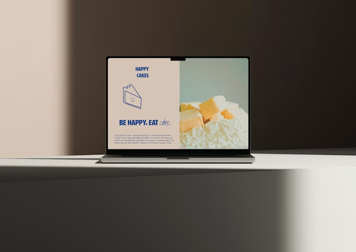
Typography runs two weights. A bold sans-serif for 'Happy Cakes' signals modern; a loose script for taglines keeps it human.
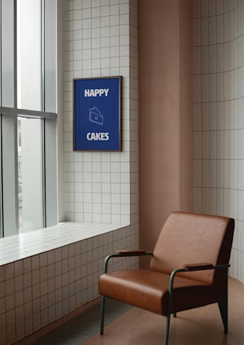
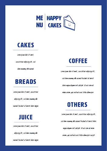
The blue-beige palette ties everything together across social templates, packaging, and menus.
