
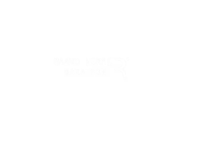
The Paavo Nurmi Marathon's existing brand looked dated. I studied the Copenhagen Marathon—clean, confident, minimal—and pitched a similar direction.
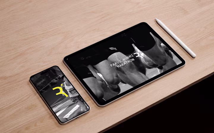
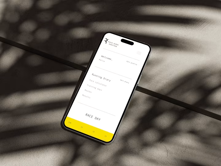
The new system
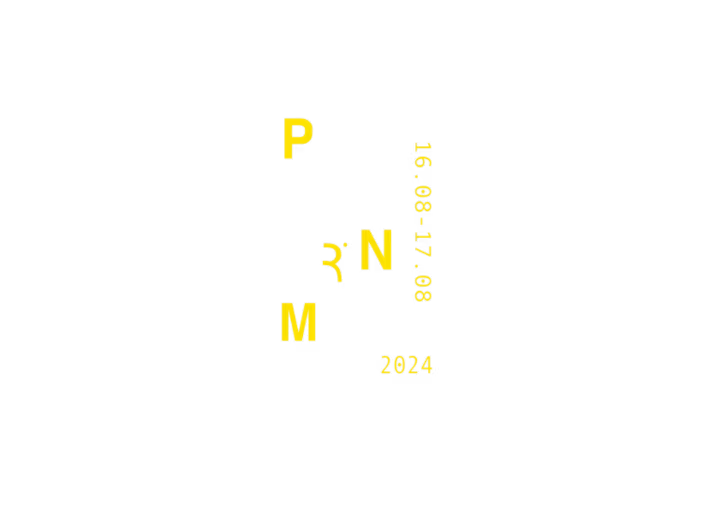
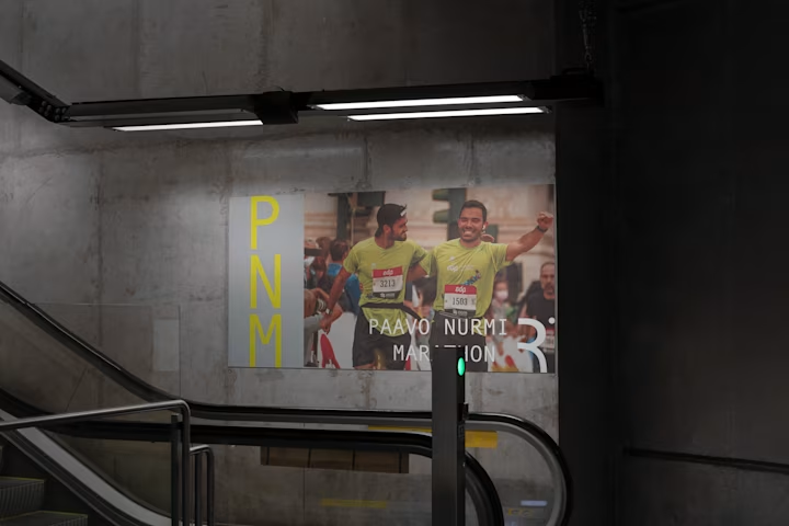
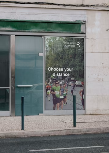
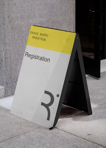
The logo strips back to geometry. It needs to read on a finisher's medal, a water station sign, and an Instagram story. Four colors only: yellow, grey, black, white. These print cleanly on race day banners in any weather.
Type is sans-serif throughout. No flourishes. Information—date, distance, location—should be readable to a runner passing at speed.
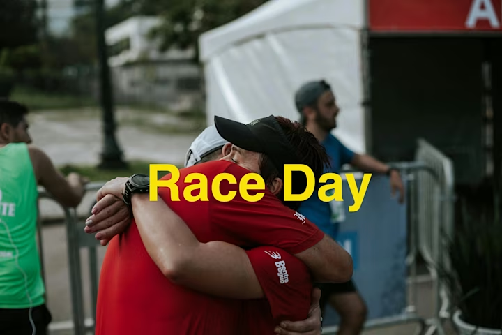
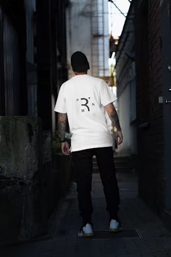
The merchandise doubles as something people wear after—a race shirt that's too busy lives in a drawer.