
Poster concepts for three different contexts: floral shop marketing, a student pop-up event, and summer-themed experiments.
For the floral shop, I explored a few marketing directions:
Seasonal flowers — posters that shift palette with the season. Pastels for spring, bold for summer, deep tones for autumn, cool blues for winter.
Bouquet of the day — a rotating featured arrangement. Shows the florist's range and gives regulars a reason to check back.
Care tips — practical posters on keeping flowers alive at home. QR codes link to detailed guides on the shop's site.
Customer photos — customers share how they styled their purchases. One photo featured monthly on a poster.
Example posters for these directions:


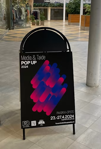
My poster was selected as the official graphic for a student pop-up event at Forum Kortteli, organized with our school. Students exhibited and sold posters, postcards, and other work.
I went with abstract shapes and gradient colours. Spent most of the time on typography. Honestly, the main goal was to make it look cool 😎.
And a few yellow-toned posters 🟨🟧 for summer 🌞🧴

