On 10 July 2027 the sun sets over Ruissalo at 22:51. At its lowest, at 1:37, it is only 7.4 degrees below the horizon, and by 4:23 it is up again. The sky never gets properly dark.
That is where Nightless Night (Yötön yö in Finnish) comes from: a speculative identity for Ruisrock 2027, the festival on Ruissalo in Turku. I made it as my own project. Ruisrock didn’t commission it and has no part in it, and the festival’s real identity for 2027 is something else entirely. This post is about the part of the identity that moves: a ten-second loop for the screens on Turku’s Föli buses.
The disc is where the sun is
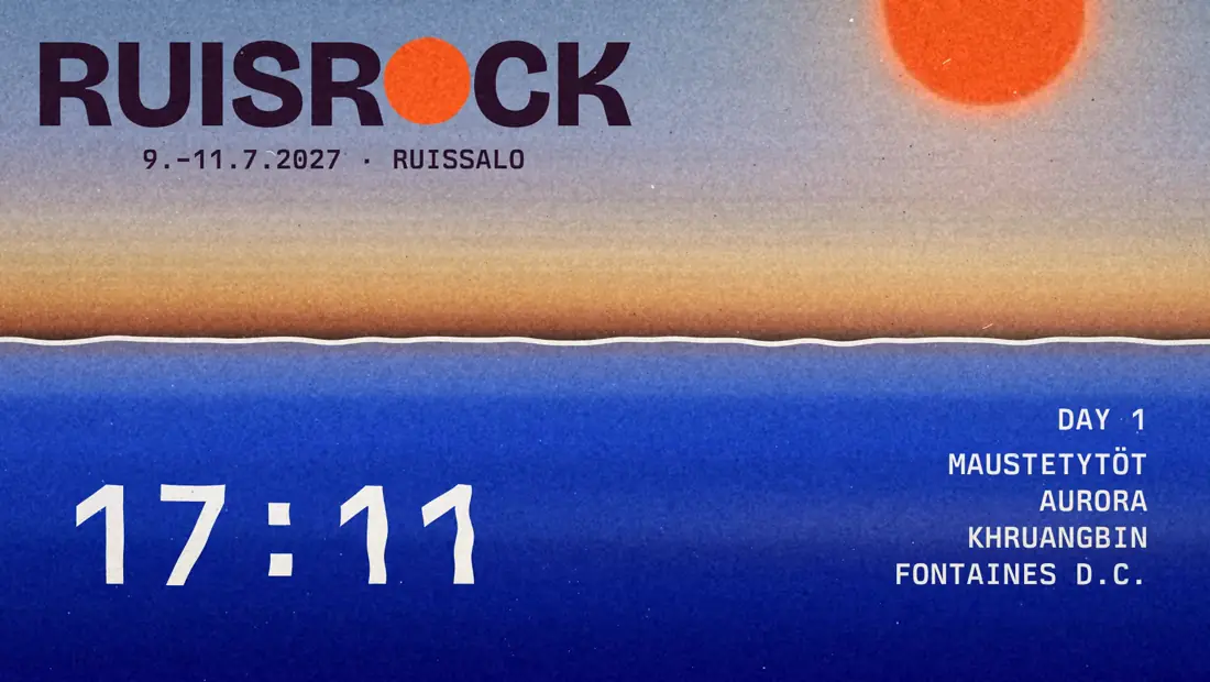
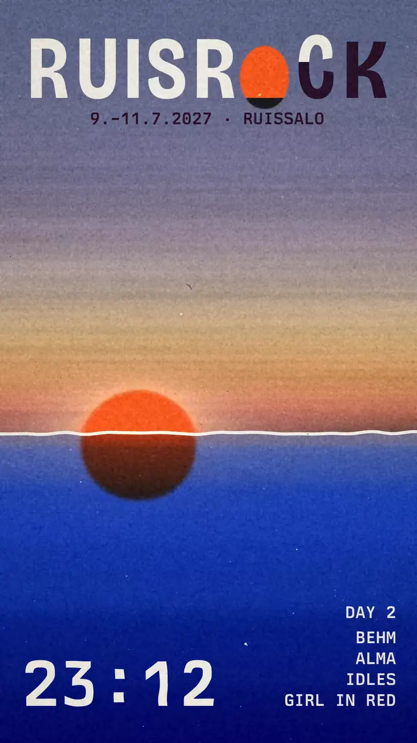
The identity has two shapes: an orange disc and a horizontal line that never tilts. Each poster is one minute of the night. The time stands on the horizon line, and the disc sits where the sun is over Ruissalo in that minute. I calculated the sun’s path for the coordinates of the festival grounds.

In motion the same rule holds. The loop is a whole day and night in ten seconds, and the clock in the bottom corner is tied to the disc. It reads 22:51 when the centre of the disc touches the water, 1:37 at the bottom of its path and 4:23 when the sun comes back up through the surface. The path itself is an arc I drew, but the times are true.
A bus screen has no sound, and people glance at it standing up. So the picture has one main character, and the colour of the sky, the time and the colour of the wordmark all follow it. On the right a three-day line-up cycles through, with placeholder names. The clock and the line-up are set in Berkeley Mono. The bottom eighth of the screen stays empty for the bus’s own information bar.
Path and pace
The first version was six seconds long. The sun moved between fixed keyframes, and I hid the seam of the loop by fading the sun and the clock out for a moment. I stretched the loop to ten seconds, the usual length of a bus ad slot, and drew the path as one gesture. The disc drops into the frame over the top edge, sinks under the water in the middle and climbs out through the top right corner. At both ends of the loop it is completely out of frame, so the fade is no longer needed and the picture comes round without a seam.
The speed took longest. On the first continuous path the sun sped up towards the sea and braked almost to a halt at the bottom, so it looked stuck under the water. I widened the curve at the bottom and raised the lowest speed about threefold. The rise was another matter: it kept accelerating and shot out of the corner. In the end I mirrored the descent in time, so the sun rises the way it sets. The slowest moment falls at the lowest point, at 1:37.

A trembling edge
A clean vector circle slid across the screen as one stiff object. I wanted the edge to have the same live tremble as hand-drawn animation, where every frame is drawn again. My first attempt gave the disc a new random shape every other frame, and all it did was twitch.
The way that worked came from Camillo Visini’s article on imitating hand-drawn motion. It uses one noise field and four related poses that swap about ten times a second. The disc stays round and the edge stays alive. The horizon has the same tremble, so the line moves like water, and the digits of the clock have it too. I softened the edge of the disc by five pixels. At fourteen the tremble turned to mush and the disc looked out of focus.

The sky
The palette has two colours, blue and orange, and the only dark tone appears where they overlap. In motion I let the palette grow but kept the same logic. The sea is a blue layer that settles over the sun, so under the water the disc shows dark, like two layers of colour on top of each other.
I first made two versions of the sky. In both, the afternoon is a warm yellow and the evening coral and rose, but in one the night is blue and in the other a dark plum. Blue would have been the obvious Finnish summer night. I chose plum because it stands out more clearly from the blue sea and gives the night some warmth.

Later the flat fields of colour softened into gradients, and I took the colours of the final sky from a photo of an evening sky. At the top is a quiet dusty blue field, and below it one long blend through lavender, peach, gold and orange. Right at the horizon the tone darkens almost to brown. Once the sun is low, the field behind the wordmark sinks into plum, and the wordmark can switch to paper white.
A wordmark that watches the sun
At first RUISROCK was plain Bricolage Grotesque ExtraBold, an ordinary font with no character of its own. I drew six directions: a reflection, a waterline, letters that grow with the height of the sun, feet that melt into the horizon, inflated letters and the Sun O. I chose the last one. The O is the sun disc, and it sinks through the baseline with the height of the real sun. At most half of it goes below the line, so the word stays readable. A sun for an O is a familiar trick on festival posters, so it had to earn its place. Here it is the same disc and the same rule as on the posters.

The colour change took the most rounds. First the whole word switched from plum to paper in a single frame. Then it went one letter at a time from left to right, but each switch was still instant. Now every letter wipes into its new colour over four frames: top to bottom in the evening, like night coming down, and bottom to top in the morning, like the sun coming up. Plum and paper are both readable only for the brief moment when the sky’s tone falls between them. So I held the top of the sky at that tone long enough for the wave to pass through the word.
The wipe comes with a stretch. At first I scaled the letters vertically, and they looked like stretched pictures. Bricolage is a variable font with a width axis, so now a letter narrows and lightens for a moment, and a spring brings it back with a small overshoot. It is as if the letter takes a breath as its colour changes. A narrow, stretched wordmark is the default for Nordic festivals right now, so here it only shows for a fraction of a second.
I wanted more playfulness, but it needed a rule, or the wordmark would just wobble. First I tried surface tension, with the R and the C stretching down towards the sunken O. I left it out. Onlookers took its place. As the O sinks, the letters lean towards it like people on a beach watching the sunset. The R and the C lean the most, six degrees, and the outermost letters hardly at all. When the sun rises they spring upright in the same order. The baseline stays straight, because the horizon doesn’t tilt either.

Last round: light and water
In the last round I made the sun bigger. Near the horizon it grows a little more and flattens, the way a low sun seems to. Around the disc came a glow in three layers: a pale haze, a peach ring and a saturated orange rim. High in the sky the glow spreads wide, and near the sea it tightens and flattens into a band along the horizon.
The idea came from Japanese gradients and the woodblock technique behind them, bokashi. The colour is graded onto the block by hand for each sheet, so no two sheets carry exactly the same gradient. Hiroshige’s and Kawase Hasui’s skies and seas were made this way, and Nuevo.Tokyo’s Japanese Gradients for UI series has brought the same soft, grainy gradient into today’s graphic design. These gradients have few colours and long quiet fields, and in the middle of the transition the tone turns into a third colour.
The sea became bands of bokashi. Each band holds flat for a moment and then slides softly into the next, and the colours come from the sky. At the waterline there is a mauve strip, the reflection of the low sky, below it a pale blue-violet band, then the identity’s blue, and finally two steps down to deep ultramarine. The steps matter: without them the sea would look airbrushed. On the surface there is also a faint warm reflection that rises to the waterline as the sun sets, then slides out and widens as the sun comes up.

Last comes a film finish: fine monochrome grain, dust and specks, faint horizontal streaks in the sky and, around the sun, a glow like halation on film. The shapes stay sharp. The bus version has coarser grain, because fine grain disappears in the video compression of the bus screens.
What I left out
For a long time the middle of the picture was empty, and I tried a festival crowd there: circles, triangles, squares and pentagons in the picture’s own colours, swaying and settling as the sun sinks into the sea. It is still in the file, switched off. Now the bigger sun and its glow fill the middle.
The moving wordmark of the early versions went too. By day it sat in the middle and slid into the top left corner for the night. Now it stays in the corner the whole time, and the movement is in the letters.
Behind the scenes I did one big overhaul. In the early versions the sun’s path, the sky colours and the clock were calculated in Cavalry with JavaScript nodes, and the program crashed every so often in the middle of work. I rebuilt the loop with Cavalry’s own nodes and ordinary keyframes. The picture stayed the same apart from the tremble: Cavalry’s own noise is calculated with a different formula, so I tuned the tremble by eye to match the old one.
On the bus and on the phone
The loop has a landscape version for the bus screens and a portrait version for phones. In the video at the top of this post the loop first plays full screen and then moves onto a phone next to a coffee cup. The posters, social images and tote bag use the same disc and the same minutes, and I finish them in Illustrator and Photoshop.
When the loop comes round again, the clock shows afternoon and the sun is somewhere beyond the top of the frame.